As we move closer to the winter solstice, the nights and even days are incredibly dark here in Helsinki. We just went a week without actual sunlight, the weather has been overcast and very, very grey. I am currently working on a lot of new projects that unfortunately, I cannot share at the moment. From the view through social media, it must look like I am not up to much at the moment. However, there are plenty of new items on my needles that will be unearthed in the Spring. Right now, I do have one project to share with you. It is older but I have not shared the design process of this one yet. Let’s take a closer look at Afield, orignally published last winter in Pom Pom Quarterly’s Issue 31. I also wanted to share something I am changing about my self-published patterns but more on that towards the end.
Photos from Pinterest.
The theme of Issue 31 was natural landscapes and terrain. I was inspired by the mood board images of topography (pictured above). I began thinking about how knitting and agriculture share similarities. Both consist of humans manipulating a natural product or natural landscape into manicured rows and furrows for an intended outcome for our benefit. So I drew upon aerial images of farmland and fields for these textures.
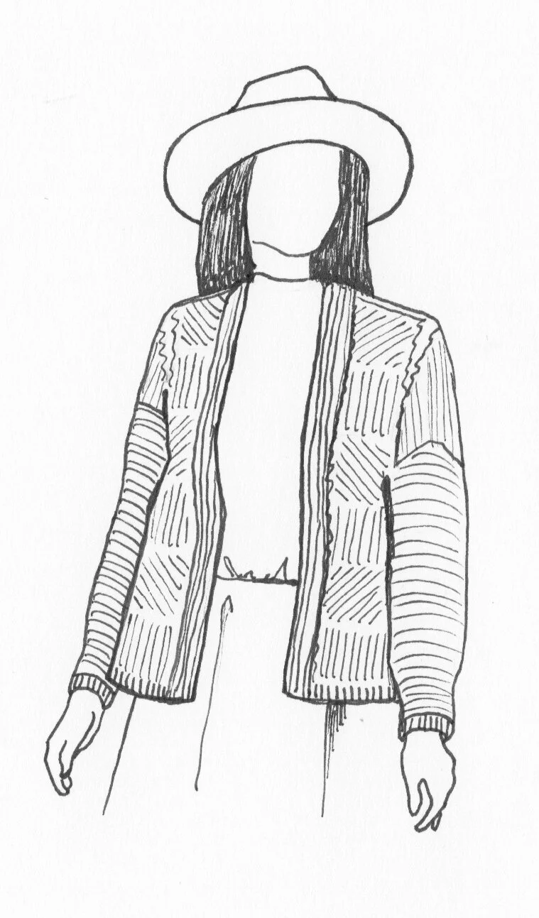
The textures used on Afield, mimic the rows of agricultural farmland as seen from above. Vertical, horizontal and diagonal lines cover the front and back of the cardigan. Slip stitches create the vertical and diagonal lines while small faux cables create the larger lines. All the cables are small enough to be worked without a cable needle. Rows of garter stitch fill in the sides and also decorate the sleeves.
Afield original sketch.
Afield original swatch.
Afield is worked in a worsted weight yarn. I originally chose Hinterland’s Range, in the colour Honey, for my sample. I wanted to use a yarn that had a natural texture in contrast to the overall pattern which is very manicured. Luckily, Pom Pom liked my suggestion and I got to use Hinterland’s Range, this time in the colour Smoke.
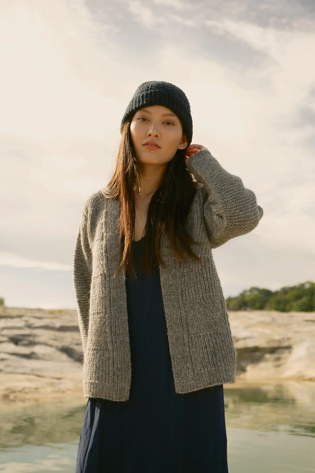
Here are a few of the original photos from Issue 31. I also want to mention the design paired my cardigan with in the magazine. Alatau is a stunning hat pattern by Ainur Berkimbayeva!
Photography by Parker Thornton.
Photography by Parker Thornton.
It have been over a year since the original release of Issue 31 so that means Afield, is now available as a single PDF download. As I was getting Afield ready with new photos and a new layout, I started thinking about the visual accessibility of my downloadable patterns. There has been a lot discussed online in regards to the accessibly of knitting patterns. How mine visually look is something I can control and I will try my best to make them more accessible for my customers.
I have only seen one knitwear designer who offers more than one version of their pattern. However, I don’t download much so there must be more who do. Francoise Danoy of Aroha Knits offers a print, mobile and LVA (low vision aid) version. Each has a slightly different layout with different font sizes. While the idea of offering one pattern that is optimal to be printed and another that is best viewed on a screen, seems like sensible conclusion but I am surprised not more knitwear designers are doing this.
I recently polled my Instagram followers about whether of not they use their mobile devices to read knitting patterns and if an extra mobile friendly version would be helpful. I got a wave of responses saying yes, both to using their phones and that a mobile version would be appreciated.
Example of Afield print version.
Example of Afield mobile version.
Above, you’ll see the two different layouts side by side, print versus mobiles. I want share what I am personally doing, incase other designers may be interested. Moving forward with self-published patterns, I will offer these two versions. Right now, I am using the 9:16 ratio for my mobile template, it fills up the screen when opened on smart phones. The font is much larger and sans serif, which is supposed to be easier to read on screens compared to serif fonts. I am also using one column of instructions instead of two. One thing I had not thought of before, was the possibility of people using screen readers to read the pattern. Having the text in one column makes this possible whereas before, the screen reader would not recognize two different columns and would read the first line from each.
All of this is a learning curve for me but I am more than happy to experiment. I want to be able to offer clean and legible patterns to my customers. At the end of the day, I would not be publishing patterns without your support.
Fiona wearing Afield.
Fiona wearing Afield.
For me personally, I don’t use my phone for reading patterns unless I am on the go and don’t feel like taking the whole book or magazine out with me. Even then, it usually just for a short period of time. When I can, I prefer to scan and print out the pages I need. If traveling for many hours at a time, for example through airports, I would much rather save my phone battery for podcasts rather than checking it constantly for instructions. The recent Instagram poll gave me a good reminder that not everybody works the way I do. Many knitters mention that they depend on the phone or tablet for patterns, saying this was their primary source of accessing the internet and their collection of downloaded patterns. Some did not have a computer at home, or access to a printer. Others knitters reached out saying due to visual disabilities or because of neurological reasons like dyslexia, a pattern with larger print and in one column would make it much easier to keep track of their place.
You’ll now receive the two versions when you download Afield through Ravelry and my own web shop, www.fionaalice.com. I had help from another designer who suggested creating a zip file to upload multiple patterns. I know this might have ben to obvious answer to some but I’m not super comfortable on computers. Anyways, it worked for these two platforms but not for www.lovecrafts.com. Luckily, Love Crafts imports the two files from Ravelry as one PDF. I am grateful for the advice of others and appreciate the open conversation around accessibility. Let’s keep chatting!


